What’s new in 2023?4 min read
Reading Time: 3 minutes
We live in a digitally connected world and our physical interactions are more with an application than a person! This is why user interface (UI) and user experience (UX) have become so important, and JioMeet recognizes this!
We here at JioMeet follow a user-oriented approach to build satisfying customer journeys with our platform! To improve your experience with us – we start the new year with updating our UI/UX! With minimal designs, smooth movements and essential features, the interface is now more adaptable and dynamic.
What’s the new user experience with JioMeet?
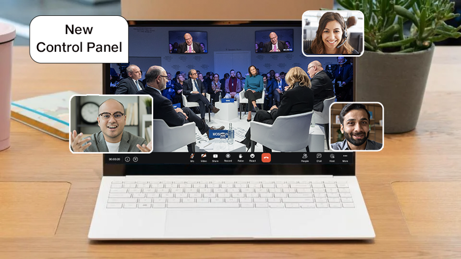
Focused Control Panel
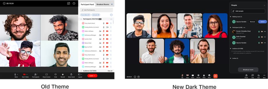
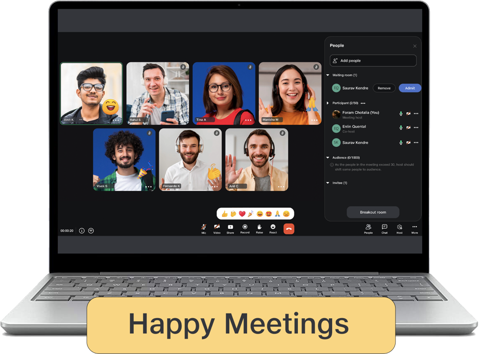
- We’re keeping it clean and going precise with our control panel! Frequently used features for personal or professional calls such as audio, video, record, raise hand and reactions are now available at the bottom center.
Previous Design

New Design

- The bottom right corner houses the option to see participants, chat box, host features and additional features that a user may want to access, while the bottom left corner houses the timer, information button and signal strength icon.
Recording Icon
- Making your life simple is what makes us productive! The feature of Recording is unique, smart, and now more accessible by being placed at the center below the grid. So hitting the record button will be much easier!
Interactive icons and layout
- Precision lies in the details! The small and intuitive animations in the icons and layouts provide users with a sense of fluidity and sophistication! Moreover, you don’t need to worry about two panels overlapping as they did before. For instance, the chat panel and participant panel now open independently!
Consolidating features
- We’re keeping the user interface easy to use by consolidating features! Layout changes, custom background, language options, full screen mode and additional settings are consolidated in the More section for users to access with a single click.
Dark Theme
- Dark theme adds a sleek and a modern look, while retaining the same functionalities! The sophisticated dark background now helps users to focus better with lesser strain on eyes, all done while consuming less battery power. This feature has been rolled out on the website, and will soon be on the app as well!

Host Options
- Running a meeting is no easy feat! So we’re empowering the host with host controls to run meetings smoothly. A host can lower all hands, mute all participants, and record the meeting.
People Options
- ‘Participants’ option is now called the ‘People’ option! Our new user-centric design focuses on the participants and audience members with its easy-to-use user interface. Break-out room feature has now been placed at the bottom that allows users to switch easily between conversations.

Bringing you the best user experience is our goal at JioMeet, and we’re working round the clock to make your journey with us more enjoyable! The updated UI has been rolled out on the web platform, and will soon hit the Desktop app versions as well!
JOIN US TODAY: https://t.jio/JioMeet


