Experience our new Meeting Layout2 min read
Reading Time: 2 minutesOur quest for rethinking how a virtual communication space could appear, kicked off with us questioning the current execution of the layouts used.
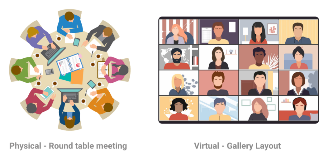
One of the first representation of a group of people in a video call was done in JioMeet by highlighting the speaker by giving them maximum screen area, while showing the rest of the people in the call-in smaller sizes, also known as active speaker layout. This reflected the physical world concept of a square table conference.

Later on, to make the video call appear and feel more inclusive, the default layout in general was switched to a gallery layout, wherein all participants in a video call are shown in equal capacity. This resembles to a round table meeting in real world. Previously our layout had rectangle tiles.
When we had to re-design the layout for a video call, we thought of how should a video call space feel. For JioMeet, our product metaphor translated to “Virtual communication that reflects in-person communication.” Except we could eliminate external distraction from our virtual calling experience, to make it suitable for work-related conference calls. These distractions came in various shapes and forms, for example, seeing someone pass by in some one’s video during a call, or observing a set of objects in a colleague’s background while they explain the ‘statistical probability of producing a heterozygous offspring’.

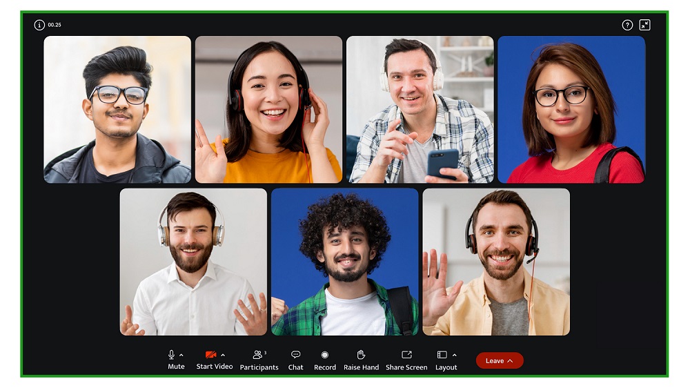
These are immediate nuisances, upon further research, we realized we could uncomplicate the way people appear, when they join from different devices. Hence the idea of square tiles came into picture.

With our new square tiles-based layout, every person in the video call can be viewed in equal capacity. With a reduced size of the background, one can remain carefree about the place they are joining a meeting from. People using mobile phones appear the same as people using tablets and desktops, all uniform.
Have a JioMeet call today!


